

This is experimental article, where you will see whole redesigning process behind the scenes and read different way of thinking. In this review you will be leaded through necessary steps needed to get successful redesign.
If responses and feedback will be positive, we will make this monthly or even weekly event analyzing also well known blog redesigns – showing pros and cons. I think real examples are the best way to show the point and teach something! Let’s start – we will be happy to hear your feedback! It will be exciting!
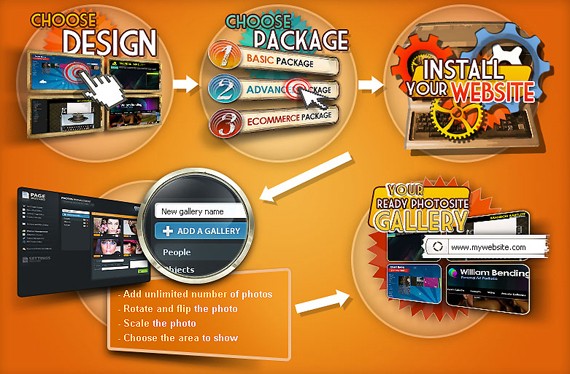
ReadyPhotoSite is a flash photo CMS created especially for photographers, painters, artists and people of art. The CMS is presented in 3 different packages that vary in functionality and a number of skins, so you can choose the design you like and then choose the website features.
We started working on this ReadyPhotoSite project on May 2009 together with Karen Myers who is presently the CEO of readyphotosite. But Karen is not only a partner, but also a good friend of mine so we were both into it. By the time we started working on website design, the product (the CMS and the skins) was ready and our task was to launch a simple website as soon as possible, apply the changes and make the updates as we go. And so we did.
Starting with a simple website and the problems we faced
The website we have uploaded online consisted of the following main pages:
- home page
- products page
- why buy
- link to blog
- contact page
- links in the footer to Tutorials, TOS, Privacy, Tutorials and Hosting.
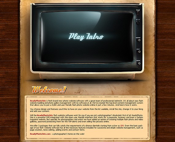
The home page had around 10 lines of text and a cool stylish intro in retro style in the middle – home page didn’t share almost no information about the product and thus was pretty useless. Besides it took around 30 seconds for the intro to load and we were loosing most of the people already in beginning process when they were visiting our home page.
Still the owners of the project insisted we should keep the intro as they spent a good amount of money on it and wanted to see it online no matter what.
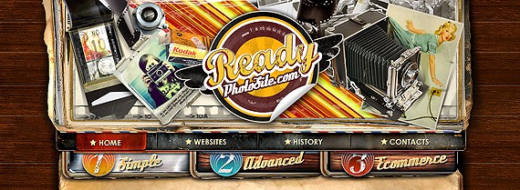
As I have mentioned at the very beginning of the post, the ReadyPhotoSite websites are available in 3 packages:
- basic,
- advanced
- ecommerce
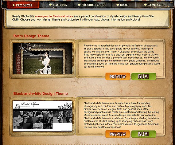
Look above, there is the screenshot showing how this concept was presented on the website.
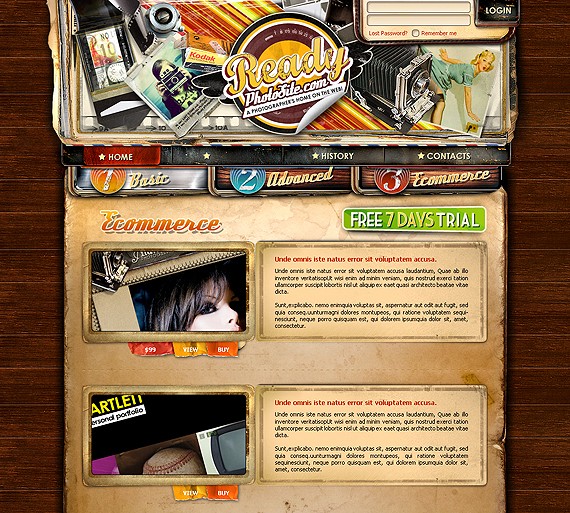
While the products page itself had the basic text info, the buttons in the header lead to almost identical pages of basic, advanced and ecommerce packages that had:- screenshots of design themes listed on them
- the link to the preview
- the buy button
All the pages had the list of the same theme’s screenshots which was obviously somewhat confusing for the website visitors as without visiting the features page they had no idea of the difference and they just saw that same designs.
The initial purchase process was even more complicated. The buy button next to the skin lead to a static html page with 2 options to choose from- “Host with ReadyPhotoSite” or “I already have hosting” and 2 separate links that took you further to the shopping cart page( the WHMCS shopping system allows creating only static product links). It was only later that we realized that the purchase process was a real nightmare with too many steps and no convenient option to choose other design or other package.
The other thing that we initially paid no special attention to was the skin preview page, that was simply opening the website in the new window and where we were loosing customers as well since there was no calls to action or some kind of info how to move forward.
The website required a serious work. In about 3 month after launch we were getting nice targeted traffic from search engines, photo forums and blogs, photo communities, template and CMS reviews websites, paid ads, social networks and our partners, but the website was not converting the traffic into sales. We had a tremendous bounce rate of about 50% and people were staying on the website for less than 30 seconds, getting lost and not sure what to order and how to order. So we have started on conversion rate optimization, creating a user friendly website step by step.
1) Moving the intro to the inside page.
The first step we made was the optimization of the website home page that was the main landing page and where we were loosing most of our clients because of the intro. We have replaced it with the large graphical collage explaining how to launch the website with ReadyPhotoSite CMS and huge buttons next to it: free trial, link to the admin area demo and the link to the page with the intro (requested by owners). Below we had a new keywords-rich text explaining the advantages of RPS and listing some of the main features.
2) Reworking the product pages.

The products pages and the ordering process was a real pain in the ass. We had 4 tasks to solve:
- reduce the number of steps before the purchase;- give an easy option to get back to other products and packages;
- make the product structure understandable( the relation of skins and packages);
- inform the potential buyer about package features on the fly (so that they don’t go away from the purchase pages to the features page).
And here’s what we did:- Removed the buttons (and the pages) to advanced/creative/ecommerce packages from the menu.
- Replaced the text on the products page with the list of skins screenshots and added buy and preview buttons.
Now the problem was how and where do we actually link the buy and preview buttons (as there are 3 different previews for every skin (for basic, creative and ecommerce packages) and 6 buy links (as every package can be purchased with hosting or without it)).
The new buy page have solved all the tasks. Before reading this articles further I suggest to open this page online so that you check in real how it works. Click on any buy or preview button on this page http://www.readyphotosite.com/products.php and you’ll be taken to the buy page.
- we combined the preview page with the purchase page and now we keep the visitor focused on the purchase;
- the buy or preview button from the products page automatically loads the preview of the ecommerce package of the chosen theme (since it’s most expensive and we’re interested in more people buying it);
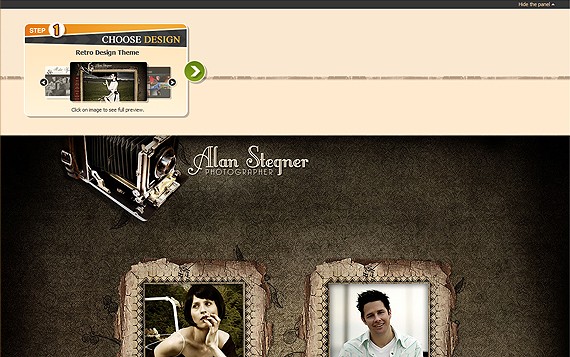
- on the first step you can browse between different themes and the preview will load below (to ensure better theme browsing we have added “hide panel” option at the very top of the page);
- having chosen the theme you can now choose the package on the step 2. Next to every package there’s the price and the list of features included;
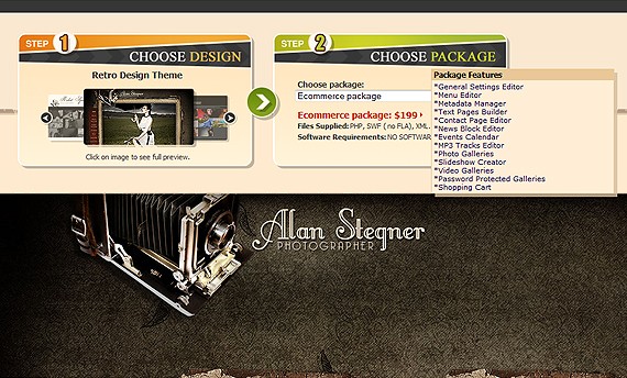
- finally on the step 3 you can choose whether to host with ReadyPhotoSite or not. You will also be shown the pricing and the hosting details.
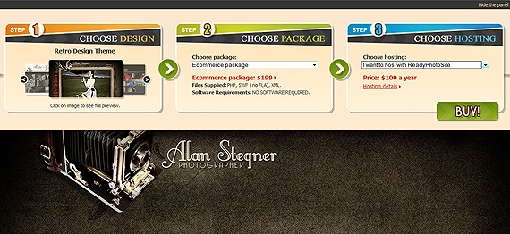
With the options for the 3 steps loaded you can still change the settings on that same page. You can choose the other theme or the other package or change your mind about hosting. Finally the buy button will take you to the purchase page with all the options you have taken.
3) The need in new pages.
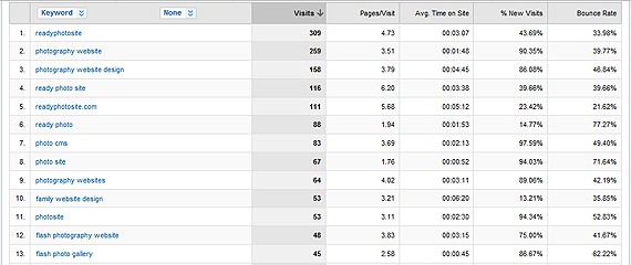
Making the analysis of the keywords people were using to find our websites in search engines from Google Analytics we have decided that it makes sense to create the keyword oriented pages giving the same time valuable information about the product. Some of the keywords included:
* Photography Website Design* Family Website Design
* Personal Website Design
* Wedding Website Design
* Maternity Photo Website Design
* ReadyPhotoSite review
While creating the pages we have faced another problem. The main website navigation allowed 5 buttons only and the footer was already crowded with the sub pages and we simply had no place to add the pages. In the next 2 points below I’ll be explaining how we addressed this problem.
4) Creating new home page.
Having tested the new home page for several months time we were still not satisfied with the results. We needed to push more people to the products pages and use the place on the home page in more efficient manner. Though the picture was good for people, the home page itself could not be called a good landing page.
1) First of all we decided to decrease the size of the header area, as it was nice but not functional so we reduced it by 40% or so.

2) We then decided to decrease the height of the collage on the home by 50% to give more place to content and other stuff.

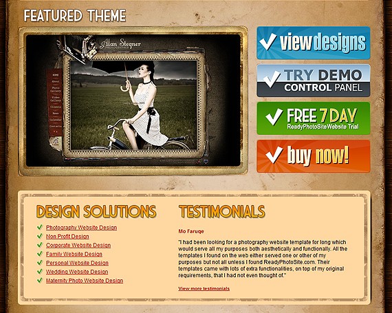
3) To catch the user attention with the products right on the home page we added the big screen of the featured theme linked to the buy page.
4) We added pretty huge buttons linking to the products page, admin area demo, free trial and the buy button for the featured theme. Having all this main options in the center of the page the website visitor don’t even have to click on the menu to go to the main pages, it’s very intuitive and user-friendly.
5) Following point 3 (the need of the new pages) we added the links to the new pages and the section for4) We added pretty huge buttons linking to the products page, admin area demo, free trial and the buy button for the featured theme. Having all this main options in the center of the page the website visitor don’t even have to click on the menu to go to the main pages, it’s very intuitive and user-friendly.
testimonials thus giving the website visitors the information they were looking for directly from the home page.
5) Reworking the blog pages

Writing lots of articles about photography, photo website design and promotion as well as just some fun posts, we were getting really good traffic both from social networks and search engines to our blog. For the first 2 months we were just attracting people by interesting and useful tips trying to get the reputation. In the new few months we have taken the following steps to make this traffic result into the product purchase
1) Added the banner to the left column offering to exchange old photography website to the new one with 20% discount.
2) Added the big buttons linking to the features page and free trial.
3) Finally we have replaced all that we have with the banner rotating the screenshots of our products, big button with the “free 7 day” website trial on it and the full list of product features. It was only this last update that has helped us to drive traffic from blog to the website features and product pages.
6) Reworking the menu structure and adding new pages
Viewing the entrance and the exit points of the website pages we were noticing that our visitors were not finding answers to the questions they were looking for. It was then when we decided to create the product guide section of the website that would contain all the info needed to make a decision.
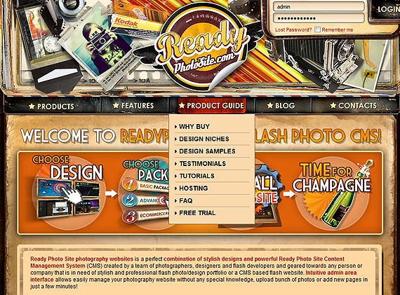
We have replaced the Why Buy page in the main menu with the product-guide and created the sub pages that now contain most of the website/product info in the structured manner. We have also created the new samples page showing how of our clients customized the default themes and illustrating the changes that can be made from the admin area.
In conclusion
We’ve made a long way studying visitors behavior before the website started looking like this http://www.readyphotosite.com. I have learned that there is always place for improvement and that we are just on the start, not on the finish. We have tried different font sizes, buttons, graphical presentations, motos and texts. We still want to try Google Website Optimizer, add Google Translate, feedback form and some other cool features to make the website even more user-friendly and intuitive. You have to act to be on board. Below are some figures from the stats showing how successful the changes we performed has been so far:
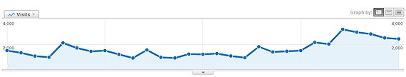
- After second home page update and restructuring of the purchase process the views of the products and buy pages has increased by 50%;
- Thanks to rotating product screens about 10% of the blog visitors now visit the product pages;
- Adding new information and keyword-rich pages increase traffic from the search engines by 30%;
- Adding product guide increased the number of free trials by 30% and the number of general product inquiries by 25%.
Unfortunately I can’t share all the details with you, but overall it was worth the efforts and we’ll keep on working!
0 komentar:
Posting Komentar